Monlisse —
Brand, Content & Digital Creative
CLIENT Monlisse
ROLE Content & Creative Designer
DURATION 2024-Present
DELIVERABLES Social|Web |Video
Full-funnel creative execution for an independent luxury leatherware brand — social, editorial, digital, and video.
OVERVIEW
creative across every touchpoint.
Sole in-house creative for a Sydney luxury leatherware brand — owning design, production, and digital end to end.
-
Brand identity system
Banner & editorial design
Social static assets
Brand guidelines
-
Campaign mood board & brief
On-set art direction
Styling & prop selection
Video editing & colour grade
-
Page layout redesign
About Us, Collabs PDF
Information architecture
Banner & motion
-
Instagram content calendar
Post-sale close events
Media & PR outreach
Performance analysis
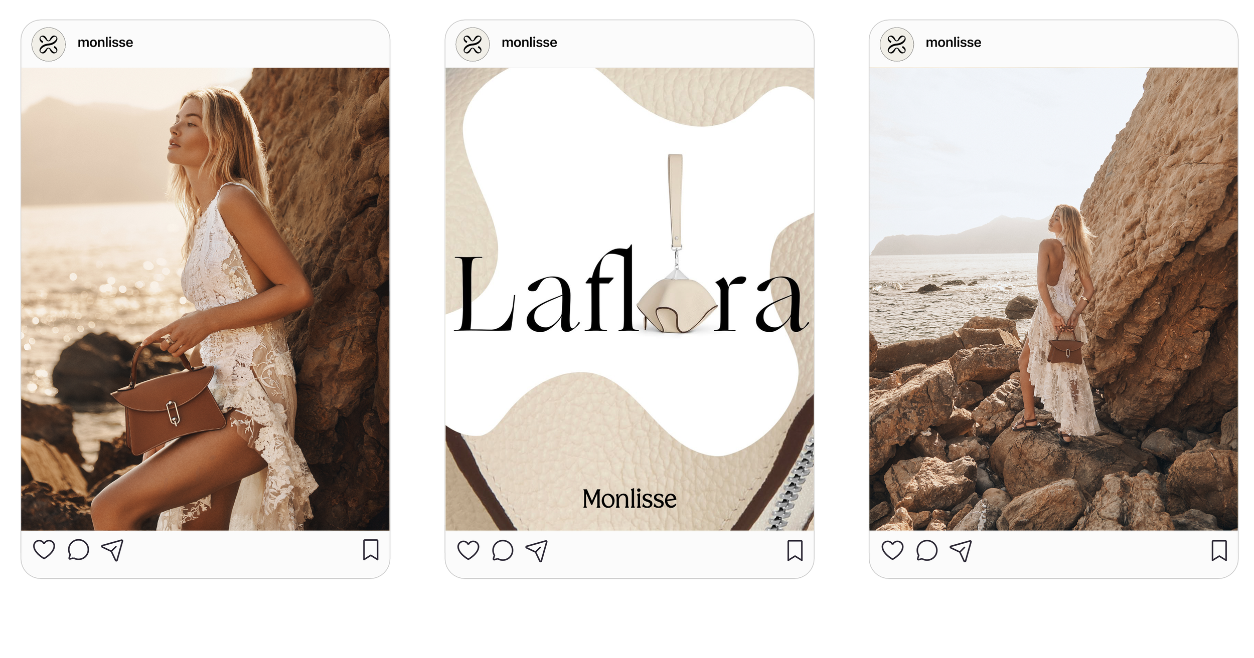
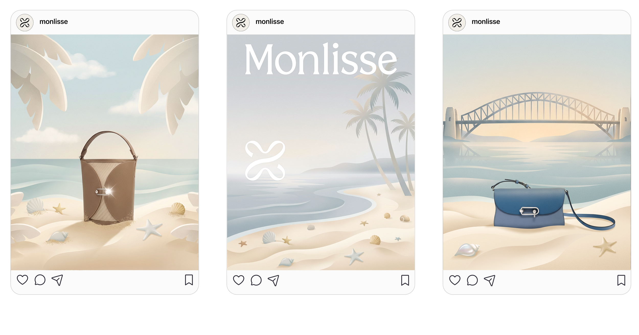
Social Content & Campaign Design
Monthly feed planning, graphic design, and AIGC campaign for a luxury leatherware brand.
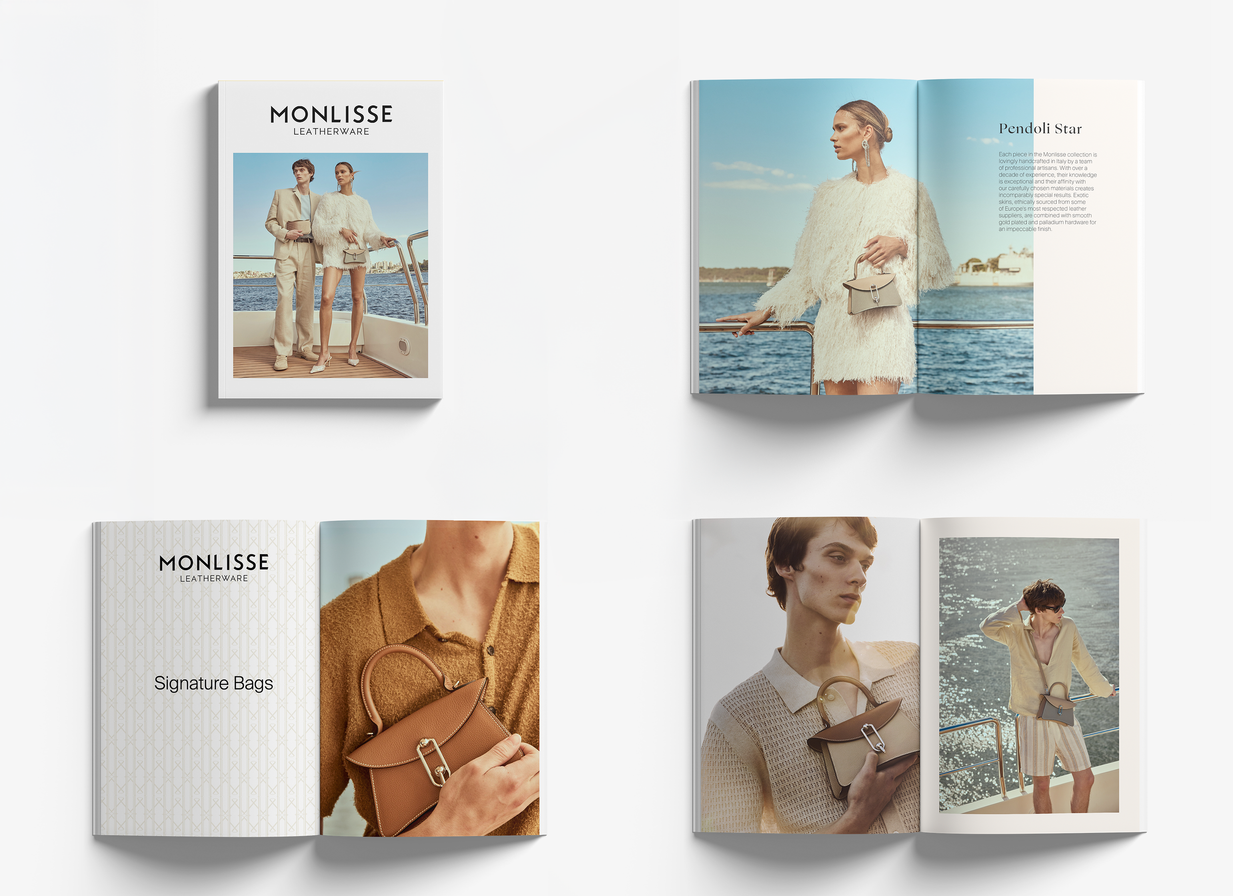
Editorial Design
Seasonal lookbooks for print and digital — layout, typography, and art direction.
Website Redesign
Homepage redesign, banner series, and Shopify UX improvements.
Homepage Redesign
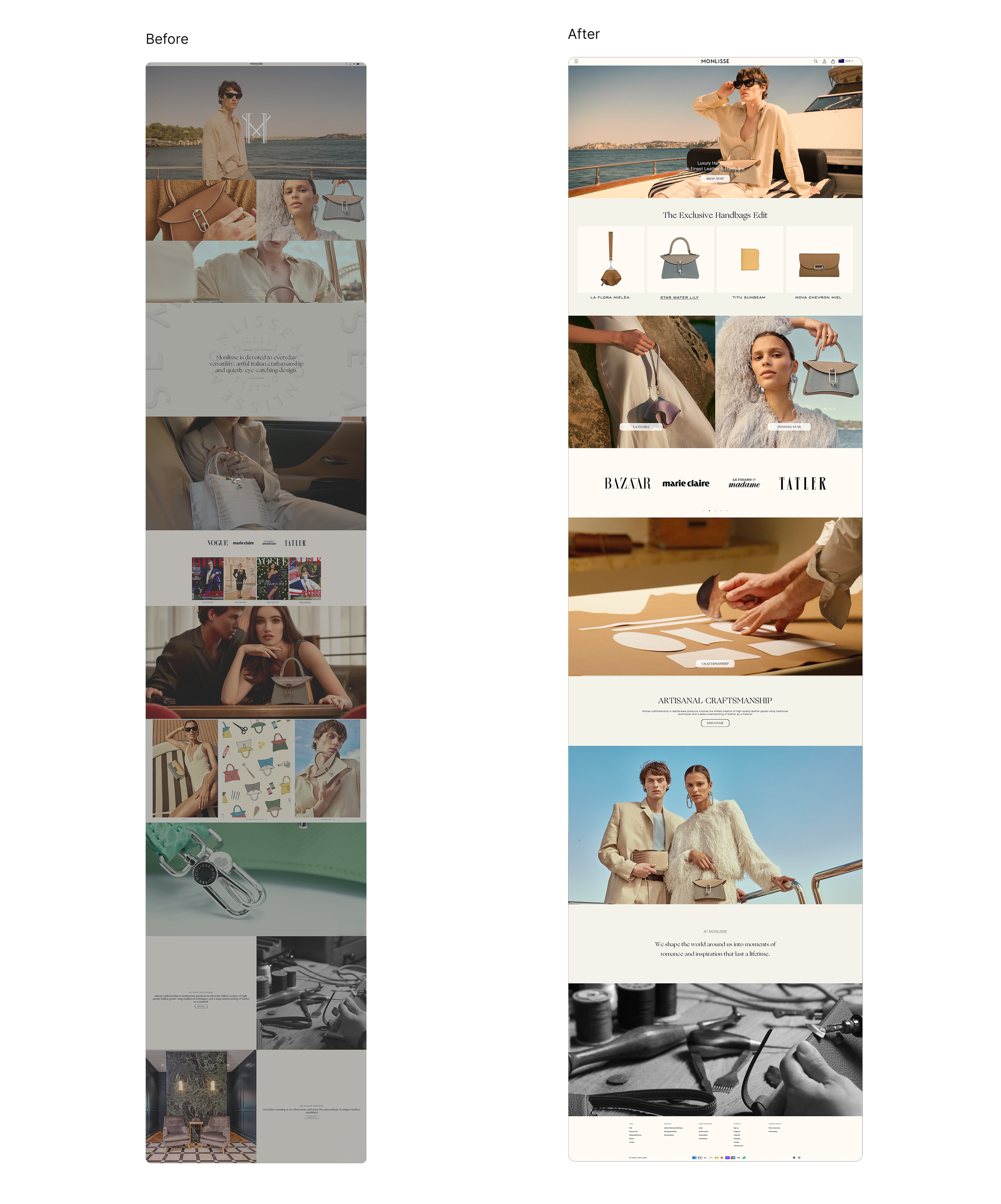
Problem
Sections lacked clear visual separation and hierarchy
Page was overly long with redundant content
No dedicated product showcase module
CTAs were unclear and easy to miss
Footer was sparse with limited navigation entries
Key Changes
Reduced page length by consolidating redundant sections for a tighter scroll experience
Added a dedicated product module to surface key SKUs directly on the homepage
Strengthened CTA visibility and placement throughout the page
Rebuilt footer with fuller navigation entries for improved site wayfinding
Established clearer visual separation between sections
Product Collection Redesign
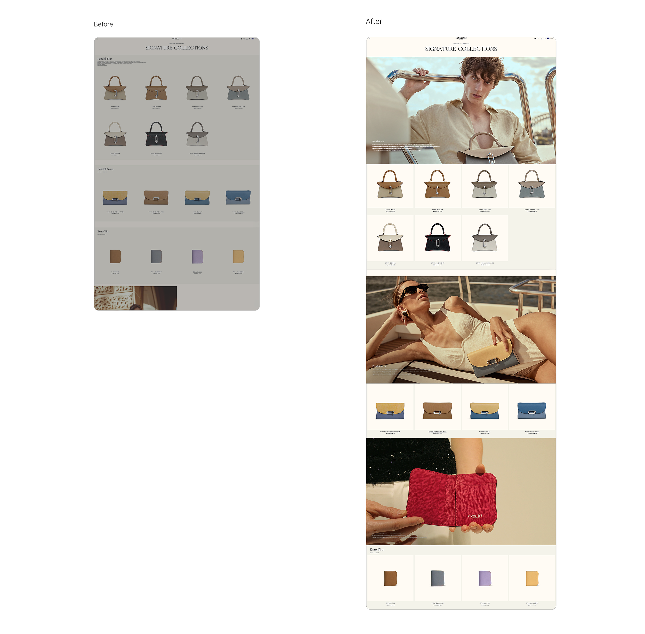
Problem
Pure product grid with no editorial context — felt like a catalogue, not a luxury brand
Lifestyle imagery completely absent from the collection page
Brand aesthetic disconnected from the rest of the site
Key Changes
Introduced full-width campaign images between each collection's product grid, creating an editorial flow
Alternated between lifestyle photography and product display to balance aspiration with browsing
Added collection-level headers with descriptive copy to establish context before the product grid
Elevated the page from a flat catalogue layout to an immersive brand experience
Product Page Redesign
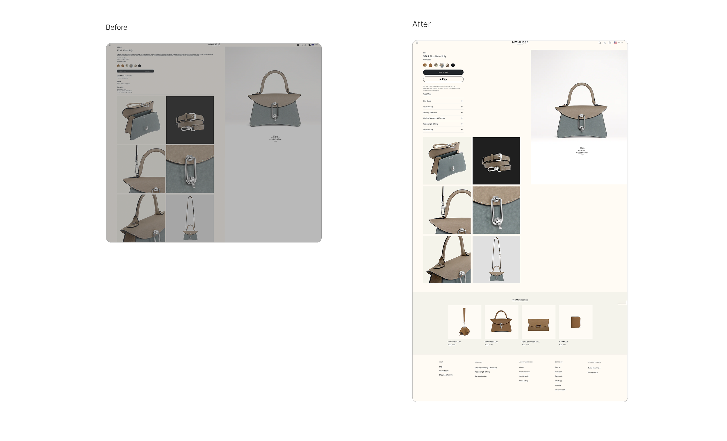
Problem
Product info and imagery competed for space with no clear visual hierarchy
No "You may also like" or cross-sell module to encourage further browsing
Footer was minimal with limited navigation options
Purchase CTA area lacked clarity and supporting trust signals
Key Changes
Separated product info panel (left) from image gallery (right) into a clean two-column layout
Standardised image gallery to a light background, maintaining aesthetic consistency across all shots
Added accordion-style product details (Size Guide, Product Care, Delivery, Warranty, etc.) to keep the page clean while surfacing key information
Introduced "You May Also Like" cross-sell module at the bottom to support product discovery
Rebuilt footer with full navigation across Help, Services, About, and Connect categories
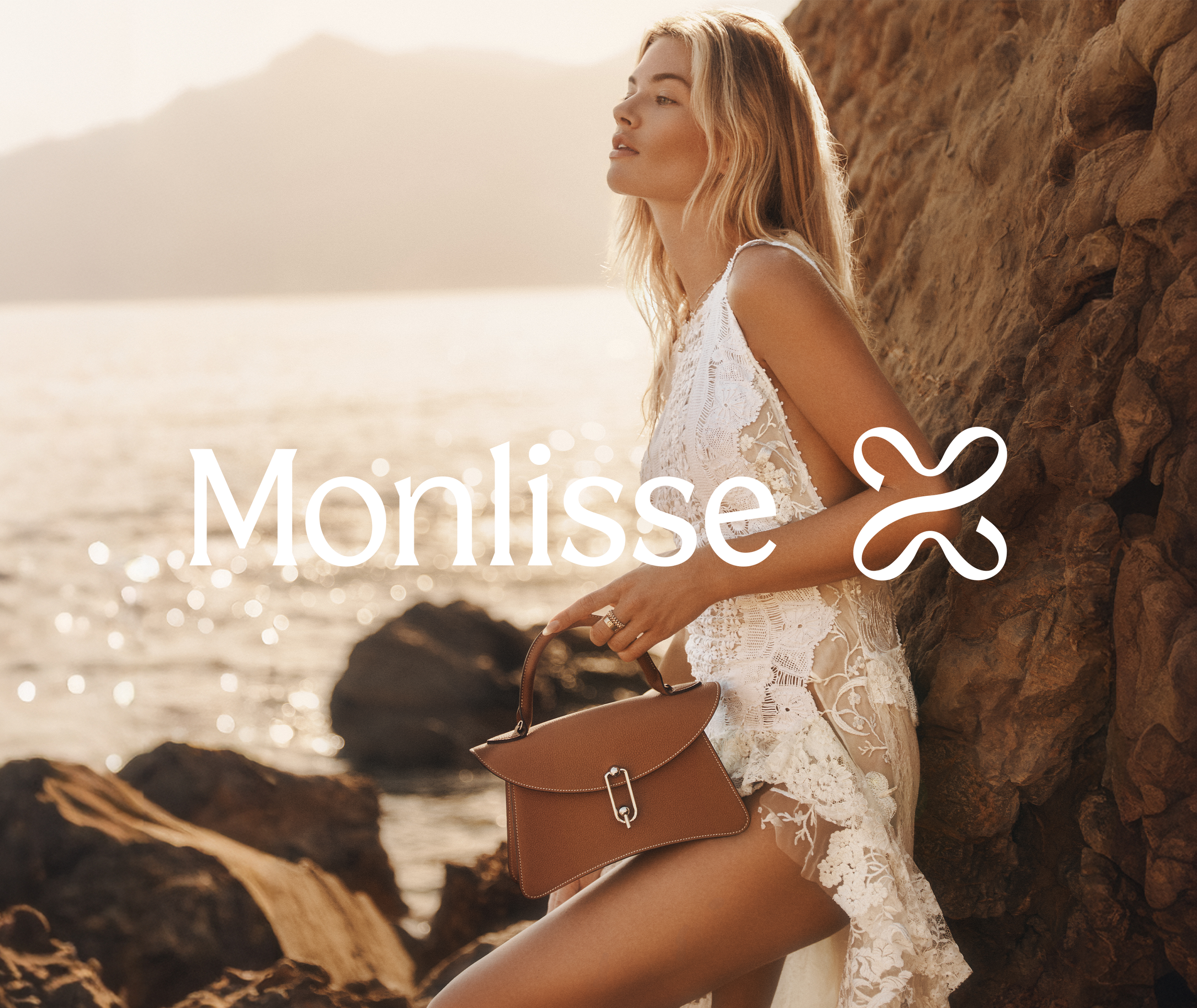
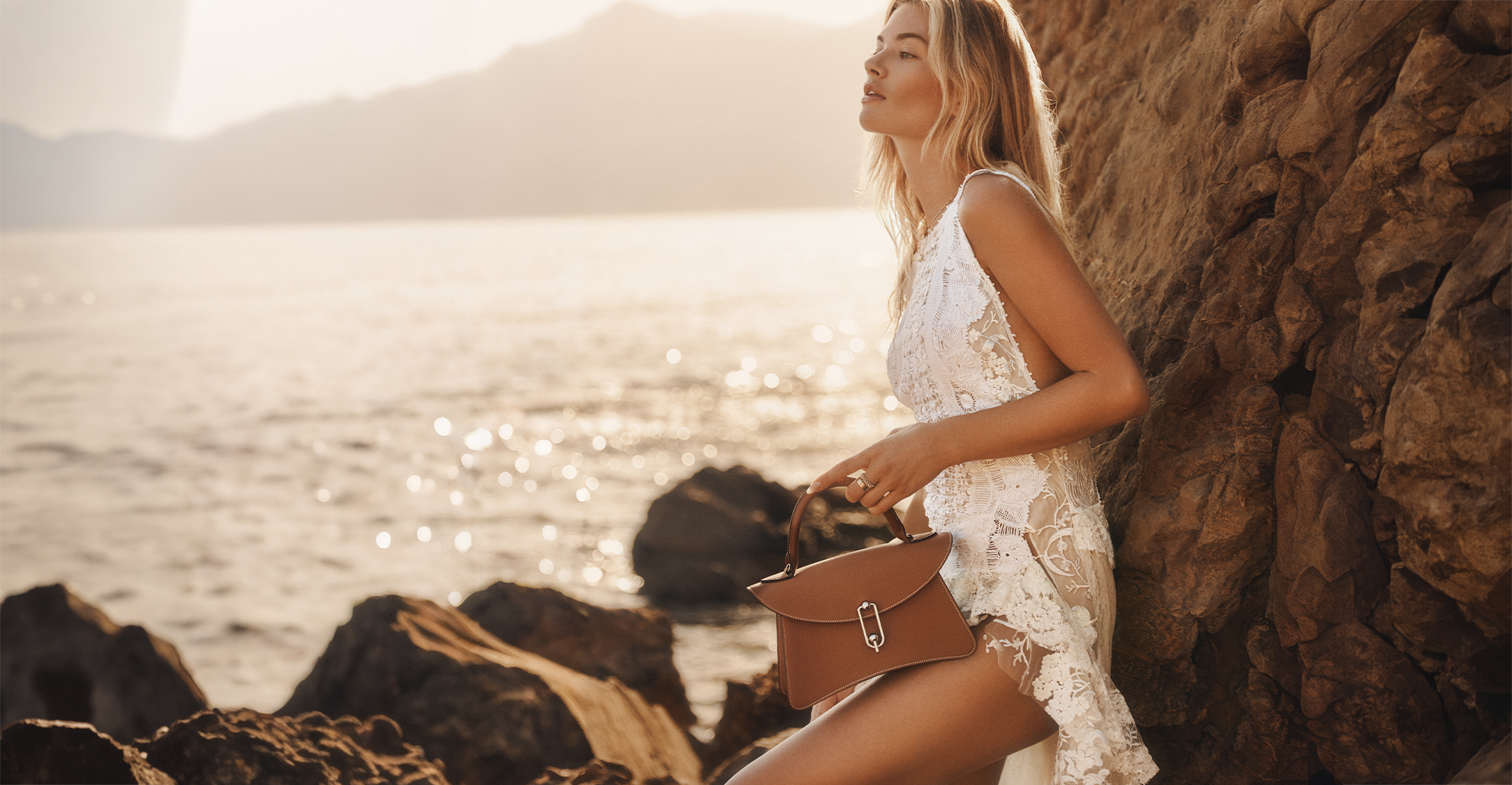
Shoot Production &Creative Direction
Mood board to final shot — creative brief, styling references, and post-production direction.
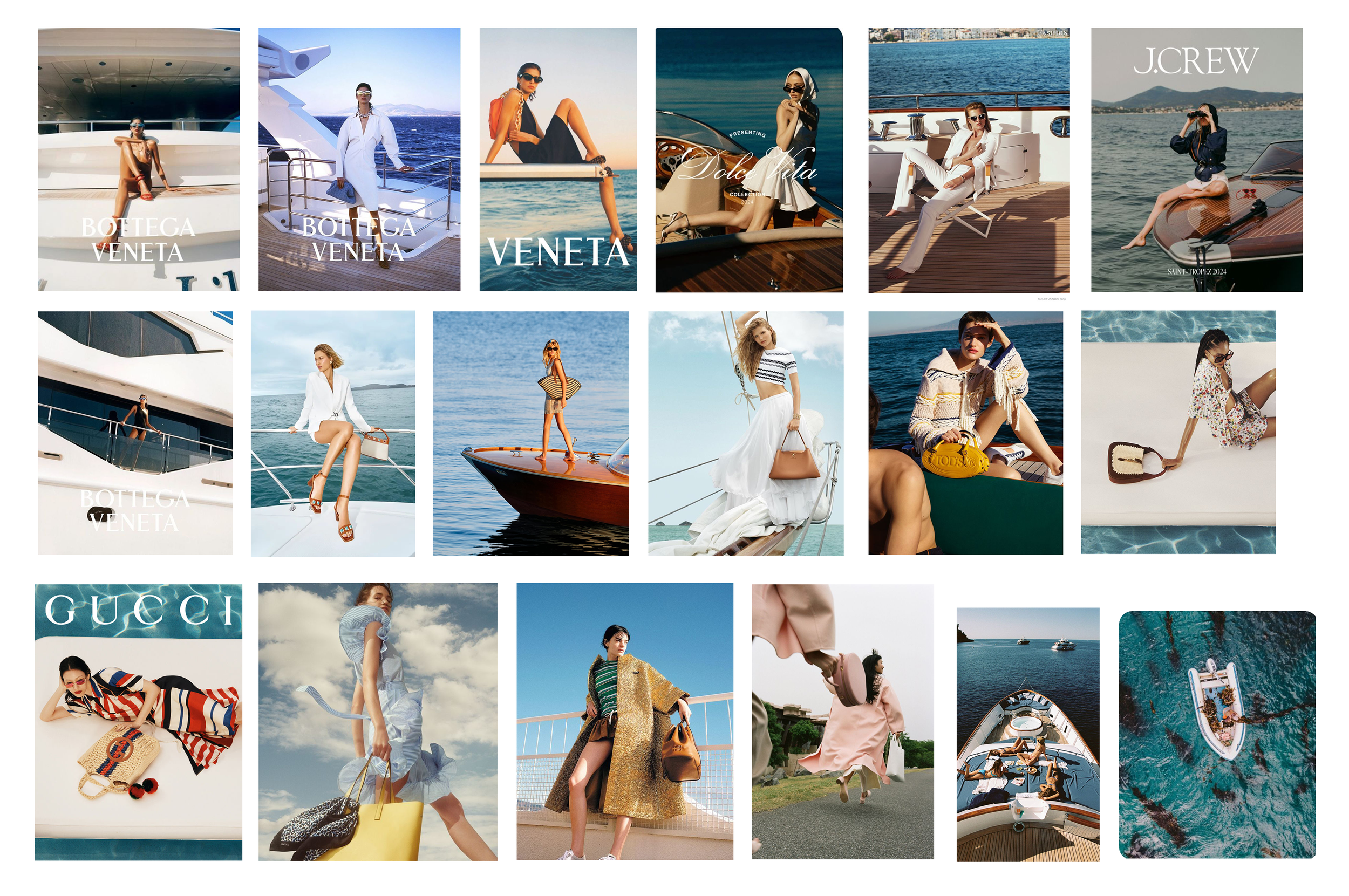
Mood Board
Final Photography
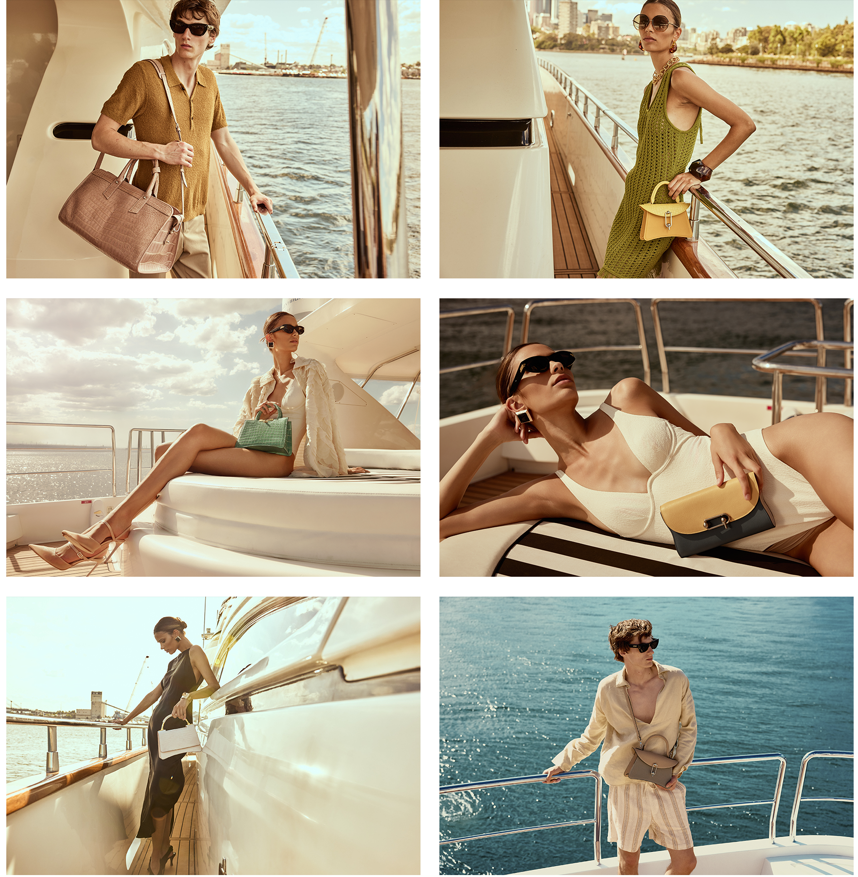
Photography by Luke Dubbelde
-
![]()
MONLISSE
-
![]()
AMAZINGSONG
-
![]()
EVOWERA