Amazing Song —
Brand Experience
& Content System
CLIENT Amazingsong
ROLE Brand & Content Designer
DURATION 2025-Present
DELIVERABLES Social|Web
Repositioning a lifestyle accessories brand from e-commerce-first to brand-first — rebuilding its visual language, content system, and digital presence from the ground up.
The Brief
From e-commerce page to brand experience.
Amazing Song is a lifestyle accessories brand built around "love and sharing." The work: elevate every consumer touchpoint — social, web, and visual language — from transactional to emotionally resonant.
-
Visual tone & direction
Content system design
Copywriting
-
Instagram Feed + Reels
Content calendar
Art direction
-
Visual redesign
UX optimisation
Product presentation
-
Content structure system
Post rhythm & cadence
Format experimentation
Social Content
& Content Architecture
From high-frequency product posting to a data-informed, brand-led content system with five defined pillars.
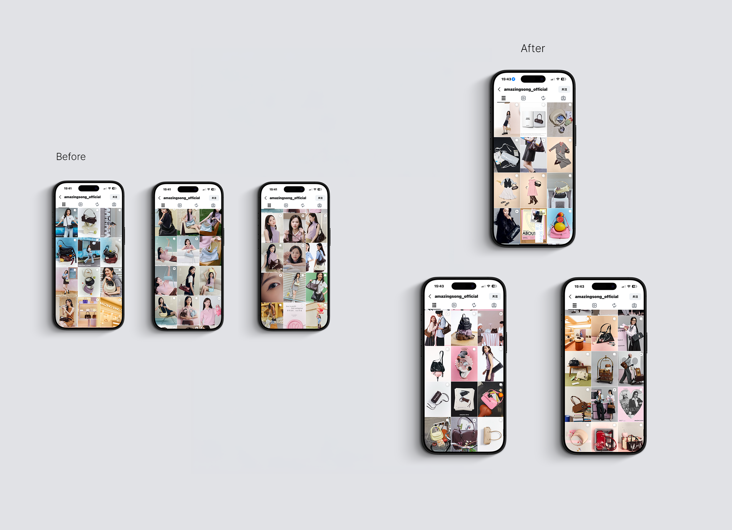
Problem
No consistent visual language — mixed aesthetics, backgrounds, and color tones across posts
Over-reliance on model-forward content with little product or lifestyle variety
Feed felt e-commerce driven rather than brand-led
No clear content structure or rhythm between post types
Busy, cluttered grid with no sense of editorial curation
Key Changes
Established a cohesive color palette and visual tone across the feed
Introduced content variety: product still life, lifestyle, and brand value posts alongside model shots
Built a content structure with intentional rhythm between post types
Shifted overall aesthetic from e-commerce catalogue to editorial brand presence
Curated grid layout creates a more considered, premium first impression
Website Redesign
Comprehensive Shopify redesign — homepage, navigation, product pages, and information architecture. Focused on eliminating e-commerce noise and building brand trust.
Homepage Redesign
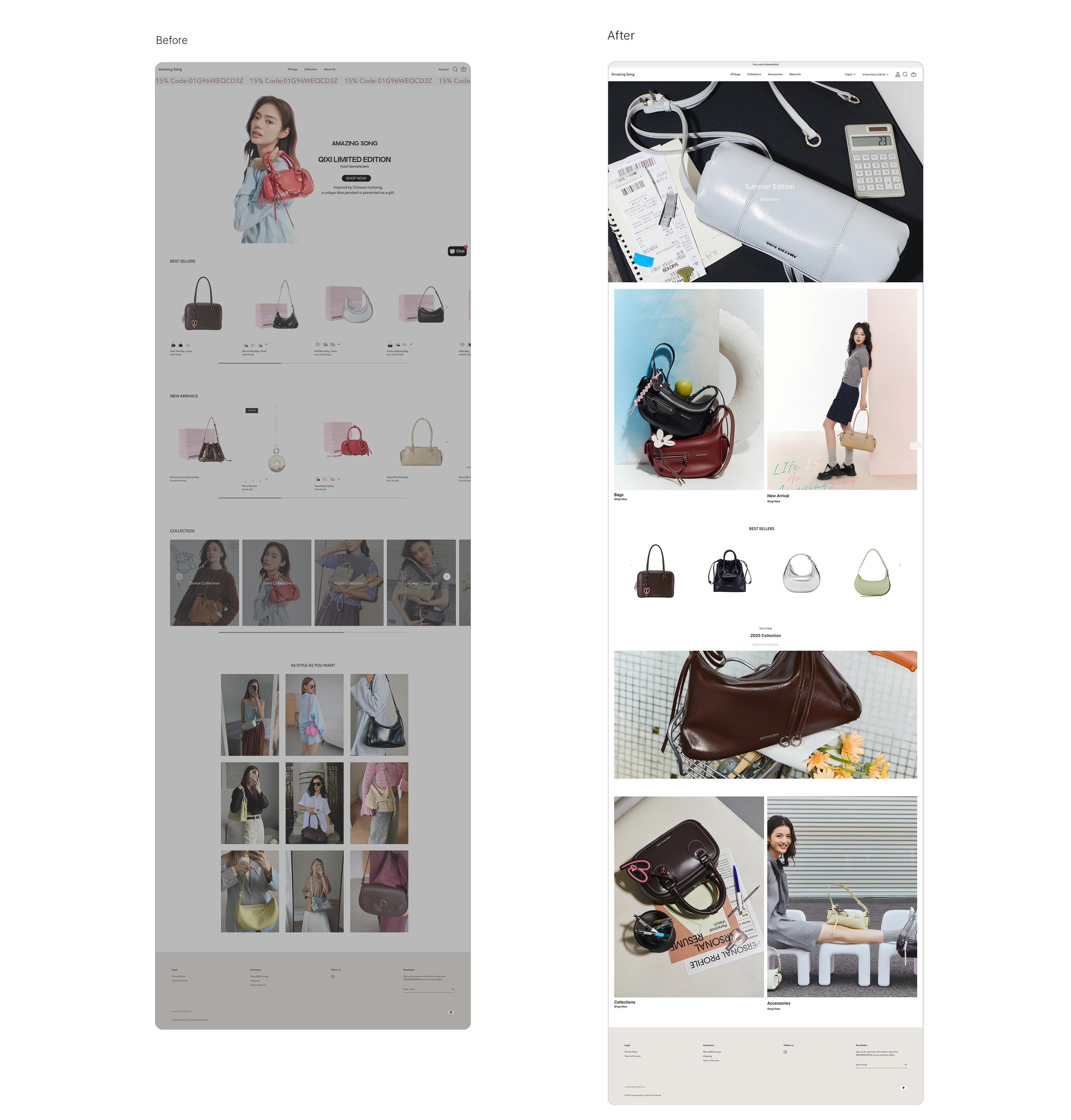
Problem
Generic e-commerce layout with no distinct brand personality
Hero banner felt promotional and campaign-driven rather than brand-led
UGC styling grid ("As Style As You Want") added visual noise without brand cohesion
Product sections felt disconnected from each other
Overall aesthetic lacked editorial quality — busy, flat, and forgettable
Key Changes
Replaced promotional hero banner with an editorial still life campaign image, establishing a stronger brand-first impression
Introduced a two-column visual module (product + lifestyle) to create rhythm and variety early in the scroll
Streamlined product sections into a cleaner, more focused layout
Removed UGC grid in favour of curated editorial imagery across Categories and Collections
Navigation & Category Design
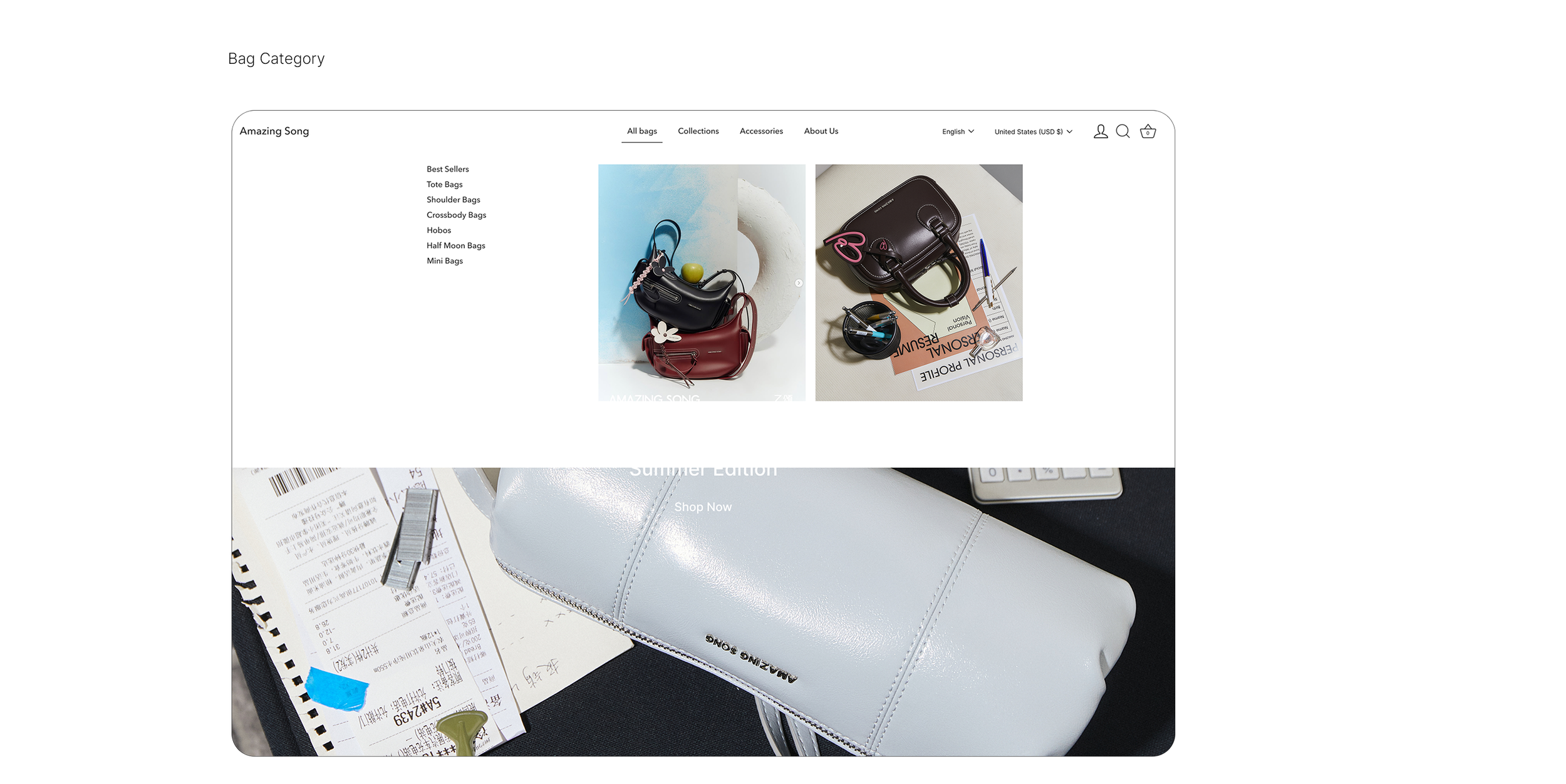
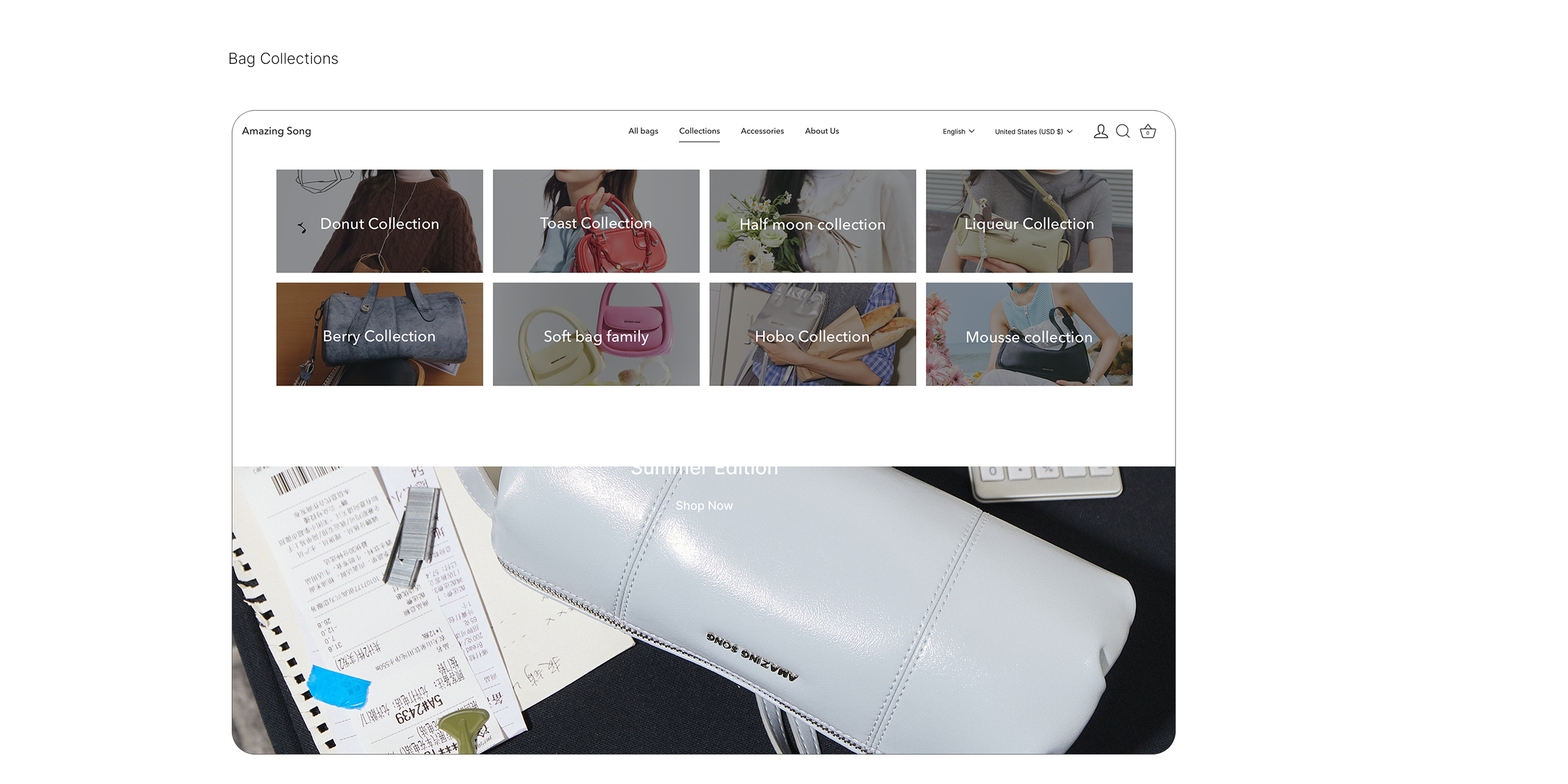
Designed two new navigation pages, a category browser and a collections overview, to improve site structure and support product discovery across the full range.
Product listing redesign
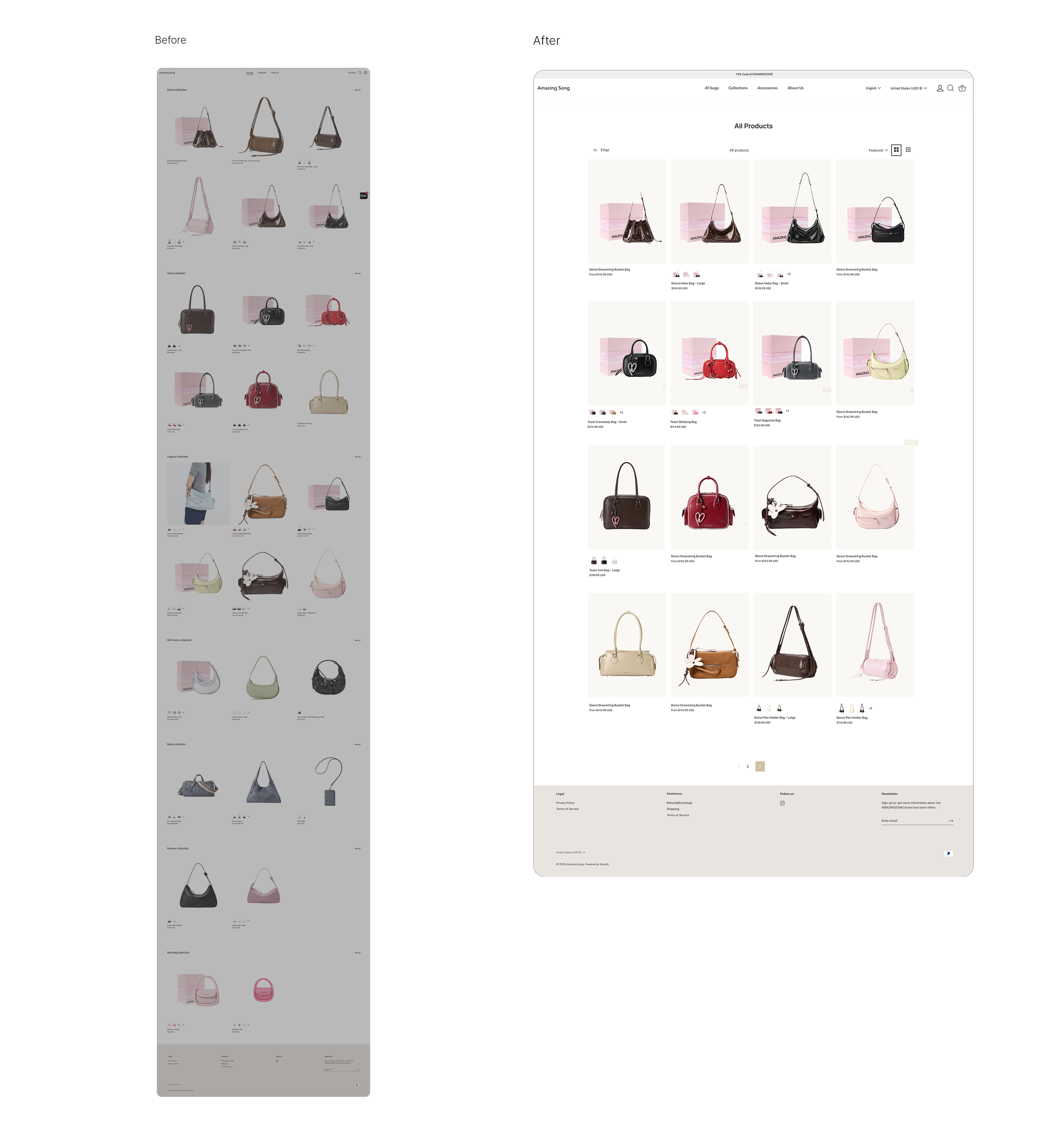
Problem
Products split into multiple separate collection sections, making the page extremely long and hard to navigate
No unified product listing view — users couldn't browse all products in one place
Inconsistent product card sizing and spacing created a cluttered, unbalanced grid
No filter or sort functionality visible
Key Changes
Consolidated all products into a single unified "All Products" grid for easier browsing
Introduced filter and sort controls to support product discovery
Standardised product card layout with consistent sizing, clean backgrounds, and colour variant indicators
Switched to a neutral cream background across product images for a more premium, cohesive feel
-
![]()
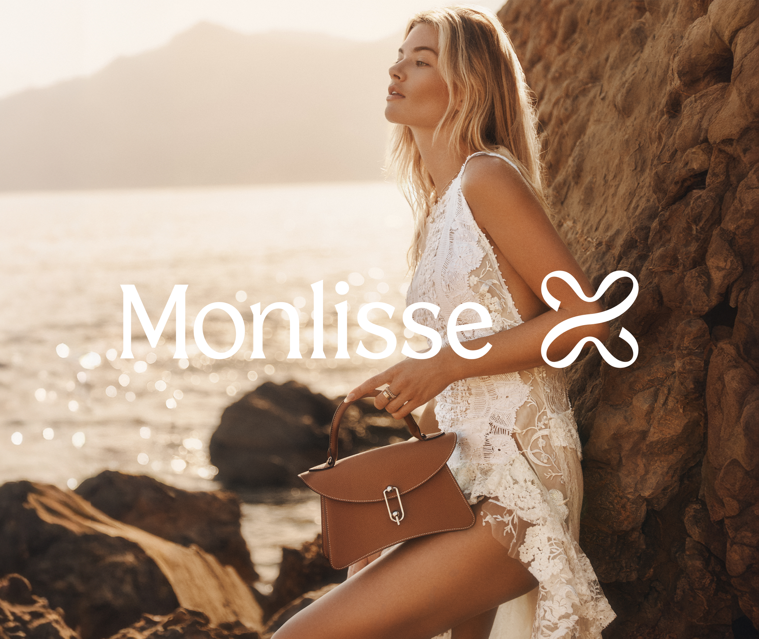
MONLISSE
-
![]()
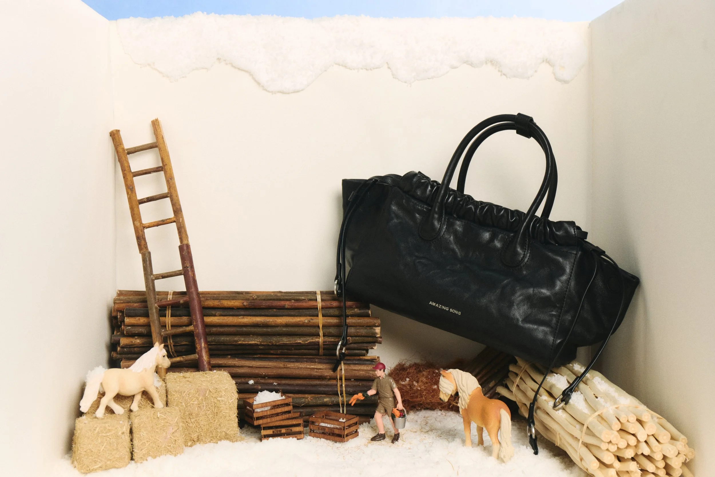
amazingsong
-
![]()
evowera